Overview
This is a critique of the Invision app. Please note that I have done a little bit for both the mobile and desktop app.
Shall we?
Product: InVision App
Role: UX Critique
This is a critique of the Invision app. Please note that I have done a little bit for both the mobile and desktop app.
Shall we?
Product: InVision App
Role: UX Critique
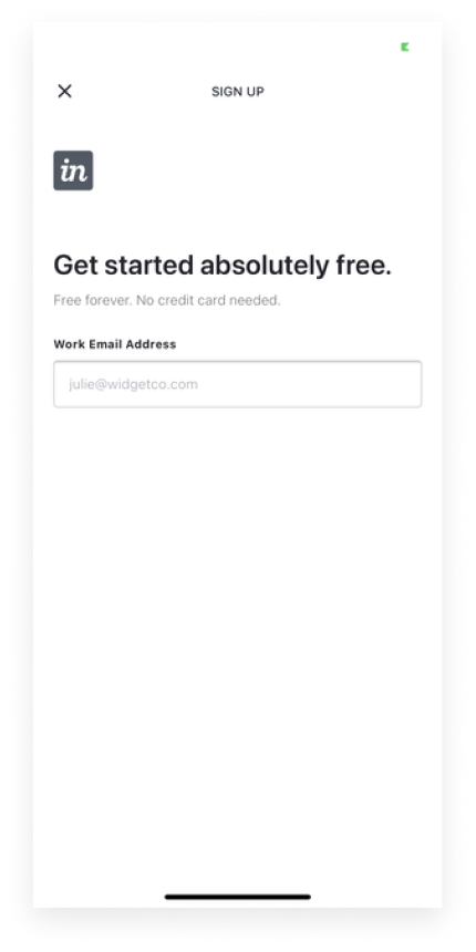
On the sign-up page, the messaging here aims to project the app's USPs but it gets lost in the crowd (this is how it appears on my mobile app). It should be more visible to augment the animations, which are a bit contextual and won't be understood without the content there in the first place.

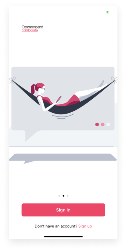
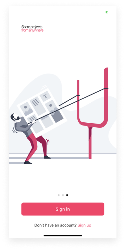
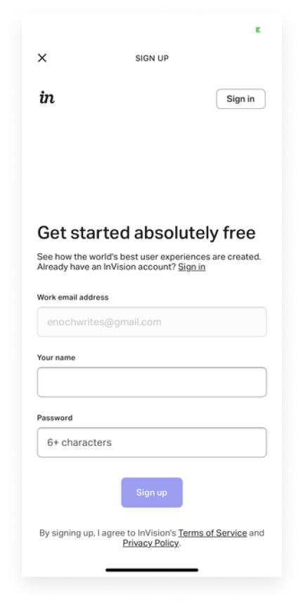
During sign-up, there were two screens that seemed to serve the same purpose to me as the user. I think it could have just been one so it doesn't frustrate the user (the second image seems just enough to me.) Also, in the second image, the hero text and the copy underneath do not necessarily have a connection with each other. Since I'm discarding the first image, I'll bring "No credit card needed" underneath here.
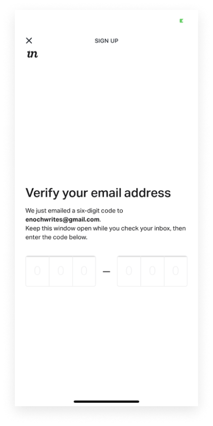
The UX flow here neglects the fact that I could have mistakenly provided the wrong email. I would have suggested a text like "Didn't get the code?" and a button with "Resend Code".
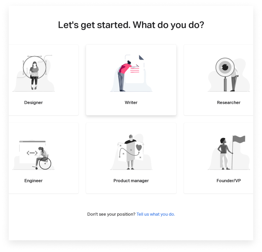
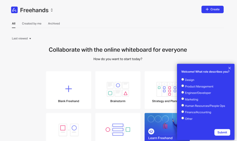
After signing up, they ask me what I do and I let them know I am a writer (see first image below). The average user like me
would assume that they won't ask me this again. But the first thing that pops up on my dashboard upon logging in is a another
question about what I do (see second image below)
Also, the image depicting the Engineer (first image) seems to be a disabled person...It may be unclear what the message is
trying to pass across. I would suggest a more stereotypical image of a software engineer, as it will be easier to connote.
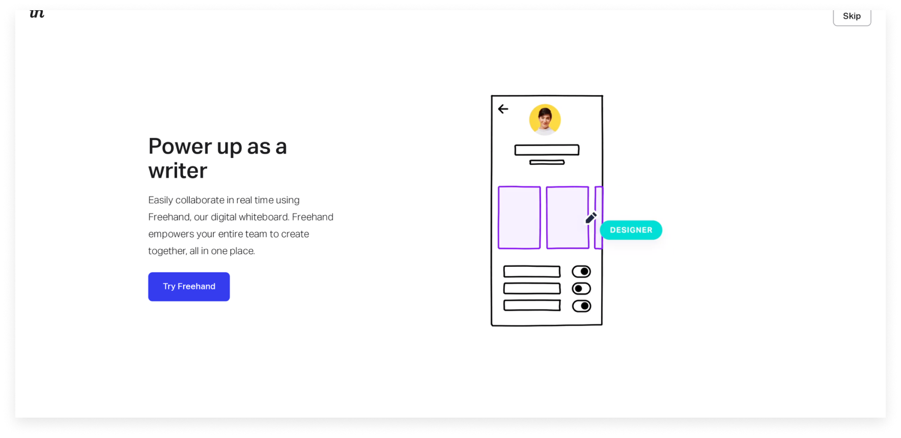
Power-up doesn't necessarily talk about how Freehand helps a writer. I think it's generic. The same copy can be used on any
tool and it'll work. Think Grammarly or Canva.
I would suggest something more specific like "Get faster feedback on copy". This is because Freehand is a collaboration tool
for the whole team and this quicker feedback is one of the value it gives a writer.
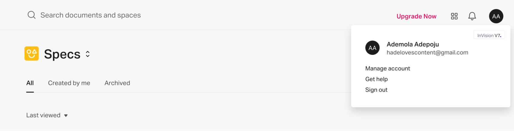
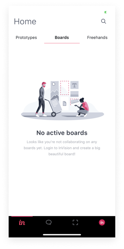
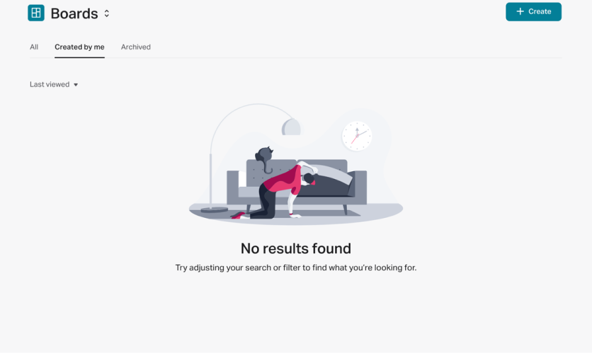
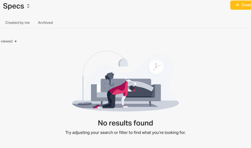
Another instance of being ambiguous is on the "Boards" page (see image below). It says:
"Looks like you're not collaborating on any Boards yet. Login to InVision and create a big beautiful board!"
But I'm already logged into the app? So, what's wrong?
Apparently, I am supposed to log into the desktop version to do this.
I would suggest making that clear in the copy. So we have something like this instead:
"Looks like you're not collaborating on any Boards yet. Login to InVision on your desktop to create a big beautiful board!"
One of the function of UX design is to make the user feel in charge. This is why I think it would have been better if the app allowed me to name my team...it makes the user be more in control of their dashboard. It's missing here as they name my team by using my first name.
As first-timers on the app, users need all the help they can get to navigate the platform properly. The InVision team gets it
right most times but forgets to on some occasions as shown in the screens below.
Instead of messages like "No results found", I would probably say a line or two about what Boards and Specs are or link them
to a page that talks about how to create these.
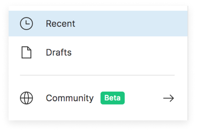
I also think the Help Centre/Community shouldn't be shelled where it is (see image below). Users who are just signing up should find it more accessible because as expected, they would have a lot of questions since it's their first time interacting with the platform.